Artwork

This was the initial design that I did, I wanted it to have a different type of stand which would give and show relevant information that is need and easily, I made a black and red back ground using acrylic paint for this, I also used a blending technique on the background where it has a stripe, around the sides you could see each text that I have stuck down. I made it a dark background to stand out the writing more also a little better on the design look, but I didn't really like dark theme I thought it was more dull, so I had to improve on that. For the pictures I simply just cut them out and stuck them together, same goes for the texts that was applied, I just cut them out also into little sections, overall I didn't really like this design, it was more of a prototype as it didn't really suit the theme colour on advertising level design and felt a little rush when doing so.
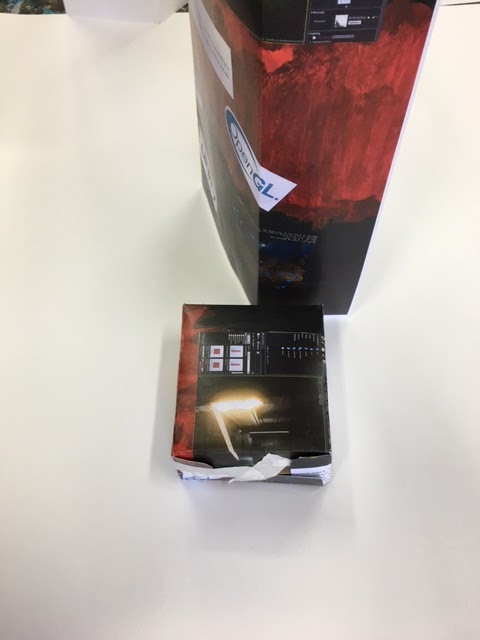

I've also done a 3d piece as you can see next to my 2d piece, for the 3d piece I simply stuck some photocopied sheets into some card paper net which can form into a shape, then cut out the net. This design were just understanding the ideas that was used and what I can simplify on my final 3d model that I can do, with the right placement on the wordings and the shapes could look much more better but this will help me to give a good base idea, I think that if I was going to reuse the shapes I would probably use a different shape, something that would be relevant with level design.
Final Piece


This is the outcome on my final art piece, and as you can see that it is completely different to the prototype that I've done and added a lot more design but changed a few. I really like the new design that I've done and the ideas of having to stand on it's shape and having a 360 motion filled with information, I laid out each picture that I will need for this and simply cut around them carefully then stuck them as design around the shape, I made it a lot more easier for people to read and understand. For example the images and information texts that was placed, I could say that I took my time on this one carefully so it would be a lot more improvements and better than the prototype, I've also used felt tips and stencils to write down the salary for a level designer in bold font, then for the background as you can see on the old design was dark and dull, with this one is a lot more in a lighter and bright and bold, I'd say it would stand out more, I used water colours with the background I simply took my time on that one as I made some fading effect with the colours I blended two light colours to make one. Overall I think that this was a much more better improvement for this and thought that I did okay with the job, improvements for this is I'd say that I could manipulate the shape a little bit more and went for something different and unique.
No comments:
Post a Comment